Channel ownership on YouTube is almost a kind of art form in itself. In order to be successful and go like clockwork, it has to follow some rules and carefully chosen tactics, including well-structured YouTube banner templates.
The use of banners is one of the components that should be weighed with this mindset. As a reminder, a banner is the big rectangular image placed at the top of a channel’s homepage. Thanks to it, visitors get an overall idea about the channel and what to expect from its content. We mentioned the term ‘art form’ with which YouTube seems to agree.
Indeed, ‘Channel Art’ is the other name of banners on the platform. So what are the main requirements to keep in mind while designing one? We would summarize by saying: obtaining something aesthetically pleasing, catchy, and memorable.
Does this all sound too much like a cliché? Well, maybe you could try a more empathetic approach and ask yourself what you want to see on other people’s YouTube pages… There are probably some particular features in their banners that contribute to drawing you to their channels, right?
And what about your own channel setup? How are you doing design-wise? In case you aren’t feeling inspired yet, our article is here for you. It will make you discover the latest tendencies seen in YouTube banner templates. You will also find a mini practical guide to design your own banner.

Golden Rules for Great Banners
As hinted at in our introduction, a YouTube banner is the primary component that welcomes your visitors. It’s a way to say, ‘Hello folks; this is what my channel is all about.’ Depending on how good it looks, people who have landed on your channel will decide whether they should ‘take it or leave it.
The word good should be interpreted both in terms of beauty and clarity here. Your banner must be visually appealing while also clearly describing the purpose of your channel. And we all know how first impressions tend to stick around, don’t we? So it wouldn’t be exaggerated to claim that the whole future of any YouTube channel depends on this aspect.
But where does one start exactly? Before rushing to create a YT banner, channel owners would better plan things out to promote their YouTube channel. Firstly, it’s important to note down the elements that a Chanel Art should include:
- Brand-related elements. In most cases, a channel represents a certain brand. So show this connection through your banner. By brand, we are also referring to the distinctive signs used by artists (e.g., the famous tongue and lips of The Rolling Stones). Exhibit your personal logos, slogans, colors, and text fonts.
- Purpose. Once again, this is a must. You have to tell your audience what your channel is about what it promises and/or offers. Try to be as concise yet informative as possible.
- Whereabouts. You may add some details showing where else people can find you and/or your products. Some musicians indicate other platform names where their albums can be purchased (Spotify, Apple Music, etc.). There are also many channel owners putting social media icons to redirect visitors to their pages on the related services (Facebook, Instagram, etc.).
Technical Details
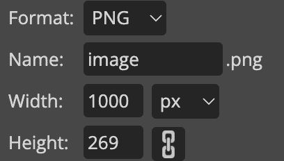
No matter if you are using ready-made YouTube banner templates or crafting your own one, there are some invariable standards. Go for a premium attitude by incorporating high-resolution visuals and fonts. Much better than having a blurry YouTube header that would make your audience doubt your professionalism, don’t you think? Besides, be sure to adopt the appropriate dimensions. That’s how you will get a squeaky clean look on your homepage.
- 2560 x 1460 pixels for the cover picture. It’s best to place the main material, such as the logo and texts, within the secure area of 1546 x 423 pixels. The aspect ratio should be 16:9.
- 1280 x 720 pixels for the thumbnail picture.
- 800 x 800 pixels for the profile picture.
- Your file size should be 6 MB or smaller.
Now let’s explore the different possibilities for YouTube backgrounds templates.
Brand-Focused Templates
Yes, we already told you that anything brand-y should be among the central elements of your banner. But some of the available models push it even further and concentrate all their efforts on the brand only. You may join the club and opt for the same YouTube template strategy. For example, you may decide to go for something minimalistic that shows off nothing but your logo. It can even be a shadowy or glittering version of it. The message conveyed here would be: ‘Brand awareness to the bone.’
Color-Focused Templates
Your channel banner template can make use of colors in various ways to achieve its goals. Sometimes it might be extremely simple and traditionally codified. Is your brand about baby products? Well, you see it coming already, don’t you? That’s right: pale pink and sky blue would probably dominate your Channel Art. Another typical case is when YouTube banner templates serve as color catalogs on their own. For example, let’s imagine that you have a paint and coating company. Why wouldn’t you share a sample of your shades through your banner so that your future clientele gets a foretaste? In color-focused models, the message sounds more like: ‘Let colors speak on our behalf.’
Interactive Templates
Remember that we also already pointed out that some of the banners for YouTube are… well, not only for YouTube. Their owners usually have broader intentions in mind and therefore try to orient their channel visitors toward other directions. If you want to do the same, pick a banner template with dedicated icons on it. They may be used to redirect people to your other social media channels or online store. These models are also a playful way to insert calls to action (CTA). By clicking on a given button, your visitors can land on a survey, a product trial, or some downloadable material. So what’s the message in this case? We would simply say: ‘Click to take action and have more fun with us!’

Story-Based Banners
We often see some really cool YouTube banners that come up with awe-inspiring conceptions. It’s almost unbelievable how they manage to tell an entire story with just a header and a bunch of images. For instance, let’s suppose that you have a tea brand. You can go for a YouTube Channel Art template displaying a succession of photographs. The first one would show a panoramic view of the tea plantation. Then we would see a second one with the various manufacturing processes the leaves have to go through. A third photo would complete the collection with some gastronomical details: an elegant cup of freshly prepared tea next to some cookies. It’s up to your imagination. Message? ‘That’s my journey.’
You may find all those YouTube banner ideas and much more on several specialized sites. Canva, Adobe, VistaCreate, Placeit, Bannersnack, Fotojet, and many others propose a large variety of customizable YouTube banner templates. All you have to do is to spot the one that fits your channel’s style and adapt it with your own features.
Are you rather a Do It Yourself kind of person? Alright. Keep reading to start working on your self-made design.
How to Make a Banner for YouTube
The plan to follow here depends on your current skills. For example, are you comfortable enough with editing programs like Adobe Photoshop? Do you have any previous experience in graphic design? Do you really feel like making everything from scratch on your own? Either way, you can choose to play it safe and use some assistance. But, from where? Well, how about a well-established banner maker like PicMonkey or Snappa?
These comprise YouTube-only sections. You don’t have to worry about the basic technical aspects because the right size and dimensions are already arranged. If we take PicMonkey as an example, we notice a ‘Choose a blank’ subsection. This is where you can pick a blank canvas to get started with whatever YouTube material you want, with standardized sizes. In order to work on your YouTube banner background, select ‘YouTube Channel Art.’
During the next step, you will probably want to upload your images, graphics, and texts. Banner makers like PicMonkey propose alignment and retouch options. These allow you to obtain an optimized design.
If you want a more sophisticated look for your banner, the aforementioned tools also include numerous special effects. You may experiment with different gradient and texture overlays.
Upload Instructions
Once you are done with the design, it’s time to upload your banner on YouTube.
- Access your channel.
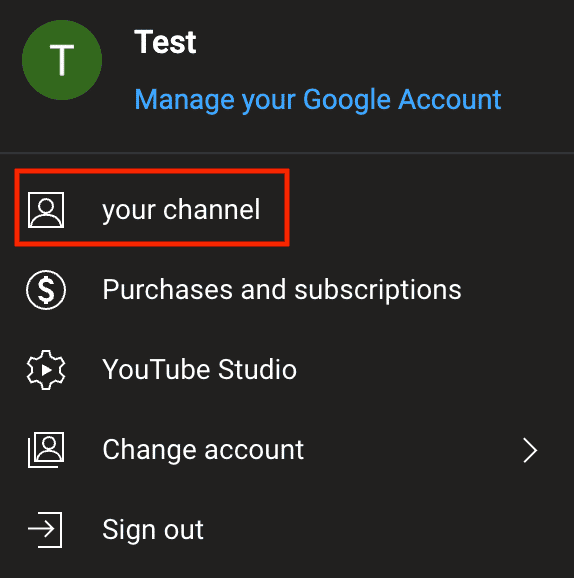
Sign in to your account and go to your profile thumbnail (top-right corner). Select ‘Your channel.’
- Complete the channel customization steps.
Hit ‘Channel Customize’. Once you are in the customization area, select ‘Branding.’ In the section called ‘Banner Image,’ click on ‘Upload.’ Pick your banner image for YouTube in the pop-up and tap ‘Open.’

- Finalize and publish.
Make any necessary adjustments. It’s better if you choose the ‘Viewable on all devices’ option. Check your image one more time and click ‘Done.’ Then select ‘Publish’ on the top menu.

YouTube Banner Templates In Short
With tens of millions of channels out there, every YouTuber has to make an extra effort to stand out from the crowd eventually. In this highly competitive context, having an appealing channel homepage is of paramount importance. Thus, you should treat your banner as a centerpiece. Craft something that will make people want to stay on your channel, explore it further, and eventually subscribe.
You can refer to our article in order to find the most convenient YouTube banner templates. We also gave you the tips you need in case you decide to build your own Channel Art. Time to make your channel rock.
Frequently Asked Questions About
Ready-made YouTube banner templates may be indeed used by several people and thus have some resemblances. This is quite unavoidable. However, you may conduct some ‘research’ beforehand. You may at least check the banners already used within your niche. By doing so, you can avoid using the same material as your direct competitors. The other obvious option is to make your own original design.
Talking about one and only ‘best’ would not really make sense. We suggest you try one of the sites already suggested in our article (see previous sections). They all offer optimum template alternatives.
It will depend on the resources and tools you decide to use. Some banner makers and providers are proposing basic packages for free. As for the paid services, the range is approximately between $5 and $70 (or more). They may ask for one-time, monthly, or annual payments. It’s best to verify directly on company pages (they usually have a pricing section). Also, be ready to pay much more if you are working with a professional designer.
YouTube has to crop out your image to make it fit mobile devices. So on these, there’s only a limited portion of your banner being displayed. The safe space refers to that portion remaining visible regardless of the environment (computer, smartphone, tablet, etc.).
Yes, you can upload a new banner through the ‘Channel Customize’ menu.

No comments to show.