Marketing has reshaped itself a lot in recent years. Although the rules of traditional marketing still apply in most marketing strategies, the practice, on the other hand, is heading to digital all the way. Building a website for marketing is a detailed process. You need to consider what kind of content will take place on your website and how you will optimize it. However, maybe the most important part when creating a web page is the content on the landing page. So, what is a landing page?
A landing page is a page that your potential customers land on after clicking a link. It is a link that includes a call to action. This link might be on several sources, such as blog posts, e-mails, or on another website. The purpose of this page is to convert these potential customers into actual ones. You may think of it as the conversion part of the marketing funnel. Yet, the landing page has several elements you need to use to succeed. They usually have a form that collects the customer’s data, such as e-mail addresses or phone numbers. It may also include call-to-action buttons to carry out sales.
A landing page is the first page your customers visit when they click on a link. That is why it is very important because it is the first impression. It is not much different from seeing a campaign sign on the window of a shop and entering the shop. Now, your awareness and consideration plans have worked, and you are in the most challenging part: conversion practice.
The Difference Between a Home Page and a Landing Page
Some people may confuse a website’s home page and landing page. Usually, they are thought to be the same, but in reality, they are not. A home page is the brief of your website; it does not have the purpose of converting people into customers. A landing page increases conversions, and it is possible to determine the conversion rates of your business through this page.
The home page includes many things, shows off your brand, and lets people have a look at your products and services. They can even go to the careers page and apply for jobs. However, you shouldn’t go after the conversions from the home page. When this is the case, there are too many distractions on the homepage. It doesn’t make it an ideal place to convert people into customers. That is why you need a unique landing page.
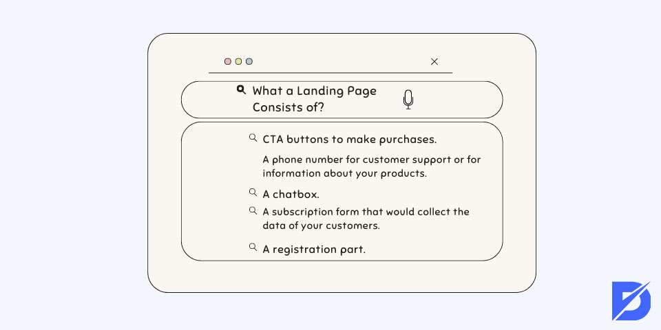
What a Landing Page Consists of?
The elements on the landing page are pretty important because, as we have stated before, it will be the first page that visitors see when they are driven from your links. It is a part of web design, and you can find agencies that are specific to do it. Yet, we are going to mention the basics of a landing page. This way, you can be aware of what you need before designing your own page.
Here are some of the elements that your page needs:
- CTA buttons to make purchases.
- A phone number for customer support or information about your products.
- A chatbox. This way, a sales representative can get in contact with the customer instantly when customers need it.
- A subscription form that would collect the data of your customers, such as e-mails and phone numbers.
- If you are planning an event, a registration part can be used.
You don’t have to use all of these elements on your page, yet these are the elements overall. Of course, you can add more if you have something useful in your mind. All of the elements you put on your page should have the purpose of conversion. Learn conversion rate optimization for your landing page.
The Style of a Landing Page
There may be several styles for these pages. However, we will touch upon the basic and efficient structure of landing page styling. First of all, you need to start with the Above the Fold part. Above the Fold is a term from the newspaper industry. As you can guess, it is the first part of the page that the visitor sees. What will take place in this part are your headlines, main image, call to action (CTA9 buttons), and a summary of your message. Let’s take a closer look.
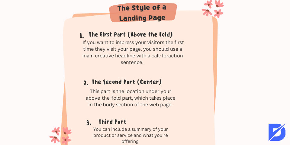
The First Part (Above the Fold)
You can have two headlines here: a main headline and a supporting headline. If you want to impress your visitors the first time they visit your page, you should use a main creative headline with a call-to-action sentence. For example, if you offer SEO services, you can use: ‘Rank Number 1 Now!’ You can back up your main headline with a supporting headline or use a slider to show more headlines.
The next most important thing in this part is your background image. The image will attract more attention than your headlines because that is easier for people to interpret the idea of an image than writing. You have to use an image that explains your business and makes the visitor think they are in the right place.
You can include a basic summary of your business or offer. You can add bullet points to make it easier to read. You don’t have to include the summary in this part, but if you do, keep in mind that it should be simple.
The CTA can be put into this first part. However, if you’re doing it, you have to make it stand out because your actual aim is to get your visitors into action. A word to the wise: don’t include multiple CTAs on your landing page. By adding just one CTA button, you can make things easy. The more options, the more confusing it is. Again, like in your main title, you can write a CTA on this button to get your visitors into action. While creating this button, you may consider using bright colors as well. It will help the visibility of your button.
The Second Part (Center)
This is the location under your above-the-fold part, which takes place in the body section of the web page. If the visitors spend enough time on your page to get to this part, you have done a great job in the previous part. Now, you have to develop stronger arguments on why people choose your product or service. You can include the benefits of what you are offering. Remember to keep it as simple as before. If you want to give detailed information, you can lead people to the page where you discuss the details. The landing page is not about details.
You can include details to make your visitors believe your product is beneficial. For example, you can add references if you are in B2B marketing. If you don’t want to include B2B references, you can back it up with other content, such as photos or videos of your products or services.
Third Part
If visitors make it to the end of your landing page, you have the last opportunity to convert them into customers. You can include a summary of your product or service and what you’re offering. Not many people come to this part of the page, but if they do, it is better to include something here than leave it blank.

Types of Landing Pages
Although the styling of landing pages might differ, we can say that there are two main types. The first is the lead generation landing pages. The second is the clickthrough landing pages. Now let’s take a look at these two-page types.
Lead Generation Landing pages
These types of pages are the more detailed ones among landing pages. They are also called lead gen or lead capture pages. These pages collect information such as e-mail addresses and names of the visitors by a form. These types of pages are popular among companies that offer B2B services.
Clickthrough Landing Pages
These pages don’t include too many details; they are right into business with a CTA button. Clickthrough pages don’t try so hard to convert visitors; they just provide a transition for making sales or subscriptions by the CTA button. These pages are highly used by e-commerce and software companies.
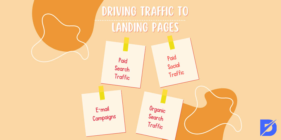
Driving Traffic to Landing Pages
There are many ways of landing page best practices for driving traffic to your landing page. We have mentioned them below.
Paid Search Traffic
Most search engines contain paid advertising. When you search for something on Google and see a website at the top labeled as a ‘paid ad,’ this is what we call a paid advertisement.
These types of ads are usually charged per click. And with such searches, you can advertise your landing page and any page you want.
Paid Social Traffic
Publishing ads on social media sites such as Facebook, Instagram, and Twitter is a valuable way to reach potential customers. It is quite possible that you can reach the traffic you want by delivering your ad to the right target audience. You can easily invite customers to your landing page with the links you provide in your ad.
E-mail Campaigns
Campaigns delivered via e-mail are also a very effective way of marketing. It’s both low-cost and a great way to get your campaign to large audiences. You can reach new customer groups as well as be in constant interaction and communication with your customers. You can attract customers to the landing page with your e-mails.
Organic Search Traffic
Organic search traffic represents users reaching your site with their searches on search engines. When your website and landing page are at a level that attracts potential customers, you can gain more customers and traffic. The higher your content appears in search engine results, the better it is for you.
You can see what is a landing page on a website after applying all these factors to your website.
Conclusion
We have covered what a landing page is and its essential elements. The primary purpose of a landing page is conversion, and it has elements such as CTA buttons to make it happen. We have also mentioned the styling of a landing page and its types.
Frequently Asked Questions About
Creating an effective landing page for your website may not be easy, but it is necessary. You should make an eye-catching landing page.
A landing page’s main purpose is to convert visitors into customers. It makes it by including CTA elements.
They are important because they help you generate leads and convert them into customers. It is a fact that websites with a landing page get more conversion rates than websites leading their visitors directly to the home page.
No, you don’t. It is not a separate website from yours. It is a page, so you don’t need a domain.
You can learn to make a website with enough dedication and will. In the meantime, you can take some courses or talk with professionals about the process.


No comments to show.