The conversion rate cannot be just explained by gained sales. Each engagement you get is a conversion. Your viewers can fill out a form, ask a question, buy a product, register to your website, or download a document. These engagements improve your website and, eventually, your sales. It is efficient to pay more attention to your landing pages and their conversion rate optimization because they are effective tools for your company’s performance. Search engines have various algorithms; therefore, paying more attention to optimization carries a huge potential for your business.
What Does Landing Page Mean?
Businesses promote their content and website to increase traffic and sales. In real-time, most clicks come from these promotions. Each link that directs users to your website is connected to a landing page regardless of promotion type. It means the pages that are reached via your link are landing pages.
The Goal of Landing Pages
Landing pages aim to increase conversion rate via call-to-action phrases. The context and action calls may differ depending on your business and goal. For instance, you may want to learn more about your audience and their behaviors. Therefore, you put a form or a chatbox on your landing page to get more information about your visitors.
Another goal may be increasing sales and purchases. If that is the case, your call-to-action phrases and buttons should include special offers or free trials to impress potential buyers.
Lastly, some interested visitors may like your services and business, but they may not be ready to purchase yet. They may need some additional information or offers. For those clients, you can put a registration form via which they can get informed about new offers.

Understanding The Landing Page Optimization
Conversion rate optimization for your landing pages helps you to improve the pages that are seen first and most. Optimization involves enhancing each component of your landing page to improve the conversion rate that you can get.
Unfortunately, it is impossible to create the perfect landing page at the beginning. You improve your strategies over time. In the process, it is efficient to collect data from your audience. Here are some tips that will help you to analyze your leads and visitors:
- Surveys are efficient and highly accurate tools when it comes to data collecting. You can include as much as questions that can give you an idea about your audience’s behavior. Just remind that long surveys may be boring for users. It means that they can have a low rate of participants.
- Advertisement campaigns can be thought of as slow but efficient tools for analyzing. Each campaign would not give you the same conversion rate, which gives a strong clue about users’ interests. If you accurately understand their attitudes towards your ads, you can include these components in your landing page.
- Social media platforms reflect each user’s interests that can help you to know your audience. Regularly share posts and encourage your followers to give likes and comments. The number and context of impressions show what your followers like to see.
- Interested buyers can contact you when they need additional information about your company and services. Preparing a report about the questions you get reflects the confusion of your potential buyers.
Possible Problems on Landing Pages That Can Affect Your Conversion Rate
Before completing and publishing your landing page, it is crucial to identify the potential issues. When you identify and work on them, you can prevent any problem in advance. Otherwise, your overall performance can be affected due to these issues.
Handling them before they occur saves your resources. It is because the precautions are easier to do and cheaper than fixing a problem later. You can use visual reports to understand where the problem is. Let’s see a couple of them below:
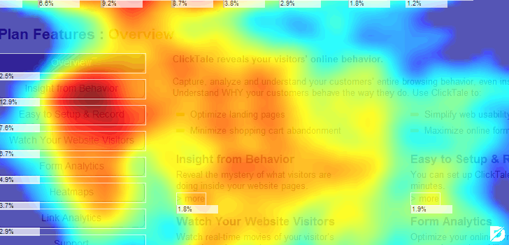
Heat Map
Some parts of your website get the most clicks, while some are ignored. Heat maps show the most clicked parts on your landing page, from the color blue to red. Therefore, you can include those parts on your landing pages.
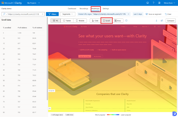
Scroll Map
Scroll maps show you where the most scrolling happened by your visitors. While orange and red parts are scrolled quickly, white parts on the map are where visitors spend the most time. Those parts may give you a clue about what impresses the visitors most on a landing page.
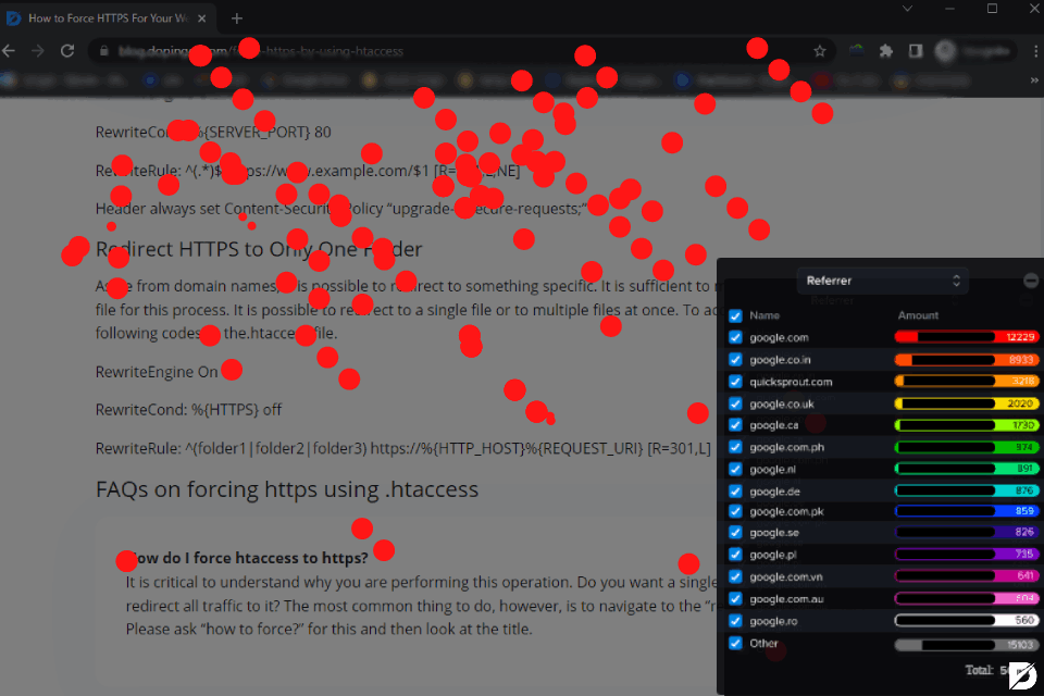
Confetti Report
Confetti reports include each individual click as dots on the page. It is a report like a heat map but in a more detailed way.
What Motives Visitors to Take Action?
It is important to identify the motives of visitors to develop your landing page. Once you find the phrases and buttons that impress your interested buyers, you can design a powerful landing page and increase your performance.
Google Analytics can help you with that step. Start to dig in and see what characteristics your visitors have. Besides, it is efficient to understand what they are looking for. The search queries and the most visited page of your website can give you that idea.
After you understand the personas of your leads, you can work on impressing them more. For instance, you can send emails of special offers to them or improve your services according to their needs.
Conversion Rate Optimization Tips
There are some specific points that you should be careful about while creating a landing page. All components of your page are important and can make a difference. Therefore, work on each part of your website, from colors to content, one by one.
As mentioned above, knowing your audience’s needs is crucial while planning your optimization strategies. You can create your content and call-to-action phrases based on them. If you feel confident about your knowledge of the needs of your audience, check these tips to carry your conversion rate to higher levels.
Clear Offers
Since you know your audience well, you should know what impresses them. The key point is making your visitors excited about your offers. Hence, try to find the perfect phrase for your audience. Make it clear that you are offering exactly what they are looking for.
Contrast Colors
When you put call-to-action buttons on your landing page, the color choice is more significant than you may realize. Contrast colors attract more attention. Thus, try to use a certain color on the page and pop-up windows. Then, pick a contrast color on your call-to-action buttons.
Important Parts as Headline
Decide on a significant point that will draw attention and put it at the top of the page. It can seem like a powerful headline in traditional newspapers. The aim is to create an interest to make people buy the paper. It is the same with websites too. When visitors see an exciting headline at the top of the page, they will want to scroll the page down to have more information.
Measuring its efficiency may sometimes be struggling. The best way to measure the effectiveness of your headlines can be to scroll maps. Via a scroll map, you can understand if the majority of your visitors scrolled the page down to learn more.
Clear Call-to-Action Phrases
Call-to-action phrases should be as short and clear as possible. You should not bore or confuse the visitor. They should understand what exactly will happen when they click the button. Besides, word choice should be simple and not fancy and complex words. For instance, “Join Now”, “Buy Here”, “Learn More” phrases are effective and clear enough.
Contact Information and Help Center
It is important for customers to get answers when they need them. They should not spend too much effort contacting you because they may give up easily when they do not have the answers they need.
The best way to prevent losing interested buyers is to include contact information on your landing page. An email address or a phone number can encourage your clients to ask for help when they need it. Moreover, you can add a help center section on your website. On the help center page, businesses write frequently asked questions and their answers. These answers help visitors to save time and effort. If they need more information, they can contact the support team for details.
Simple Landing Pages
Keeping landing pages simple shows the offer and services more clearly. It is because you should not confuse the visitor at the beginning with a lot of content and visuality. Interested visitors would not hesitate to dig your website for details. The key point is impressing them with simple content.
Testimonials
Especially when visitors do not know much about your business, testimonials help excellently as social proof. You can show appreciation from your previous clients to encourage new visitors to take action. However, testimonials should also be short and clear because it is important to keep the page simple.
The Reason Why Your Landing Page Does Not Bring Conversions
There are various factors that can make your landing page powerful or poor. Even though you add necessary and strong components, your landing page may not bring conversions that you have anticipated. A couple of reasons may cause that.
- Your call-to-action phrases may not be clear.
- Your headlines may be poor and not impressive.
- Unnecessary parts that cause distraction from the main message.
- A confusing design and a crowded page.
- Your product may not appeal to the visitor.
You may also be interested in our related articles:
How to Increase Conversion Optimization on Landing Pages
Landing pages are significant due to their visuality. Most users see your landing page before knowing your services and examining your website in detail. Therefore, you should understand the significance of conversion rate optimization and decide on your strategies properly.
If you want to create a strong landing page that can bring the highest conversion rate, you should be aware of all factors that can affect it. Even the smallest parts can cause a poor conversion rate. Consequently, before designing the page, identify what you need and how you want to do it. Decide on which components can deliver the message accurately. Confetti reports, heat maps, and scroll maps are great tools while you are working on your strategies.
Then, you can start to create the page carefully. Although you may want to show everything about your business to get more engagement and increase your reliability, you should keep it simple. Most visitors can get confused if they see too much information at a time. Let them decide whether they are interested or not. If they are interested, they will click on other options to learn more about your business.
Frequently Asked Questions About
Conversion rate optimization is essential when you aim for high numbers of sales and engagement. Most visitors do not search for services of specific companies. They search for their needs and choose the best one. Hence, landing pages should be as powerful as possible to convince clients and bring conversions.
Heat map shows which parts of your page get the most impressions. Even it shows an area, it is pretty accurate and gives a correct idea about your page’s strengths.
A landing page should not contain too many sections and parts. A headline, call-to-action button, short identification of your service, a testimonial, and a couple of images are enough to give the main message.
Conversion rate optimization cannot be powerful with one strategy or component. It is about finding the balance between including necessary components in the perfect way and keeping it simple. Hence, check the tips and important points about creating a landing page to understand how you can design it perfectly.
A landing page can involve texts and images. However, they should not be too much in a confusing way. Of course, they are efficient to show your business’ quality, but too much visuality may prevent drawing the visitors’ attention. It means that include them but still keep it simple and clear.


No comments to show.